The Psychology of Colors in Branding

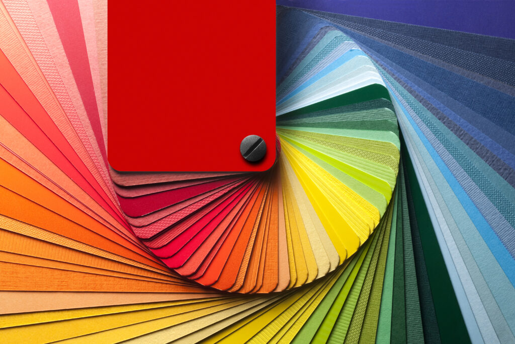
Colour plays a vital role in creating a brand’s identity and leaving a lasting impression on customers. A well-thought-out colour palette can convey a brand’s personality, values, and message effectively. However, choosing the right colours can be overwhelming, especially when there are endless possibilities.
In this blog, we’ll discuss how to select a colour palette that aligns with your brand’s identity and how to maintain consistency across all visual assets.
Understand your brand identity:
Before selecting a colour palette, it’s crucial to understand your brand’s identity. What message do you want to convey? Who is your target audience? What are your brand’s values and personality? Answering these questions will help you choose colours that align with your brand’s identity. Different colours can evoke different emotions, so it’s important to choose colours that align with your brand’s messaging. For example, blue is often associated with trust and stability, while red is associated with passion and excitement. Green is often associated with nature and health, while yellow is associated with optimism and happiness.
Choose a primary colour:
Selecting a primary colour is the first step towards creating a colour palette. It’s the most dominant colour that represents your brand. One approach to choosing a primary colour is to think about the emotions you want your brand to evoke. For example, if you want your brand to feel youthful and energetic, you might consider using a bright and bold primary colour like yellow or orange. On the other hand, if you want your brand to feel sophisticated and timeless, you might opt for a classic primary colour like navy blue or deep red.
Create a colour scheme:
Once you have selected a primary colour, it’s time to create a colour scheme. There are different types of colour schemes, including monochromatic, analogous, complementary, and triadic. Choose a scheme that complements your primary colour and aligns with your brand’s identity.
Monochromatic– A monochromatic colour scheme is a colour palette that consists of variations of the same colour hue. It’s created by using different shades, tints, and tones of a single colour. The use of a monochromatic colour scheme can also help to create a sense of sophistication and elegance in a design.
Analogous– An analogous colour scheme involves choosing colours that are next to each other on the colour wheel. For example, a palette of red, orange, and yellow would be considered analogous because they are adjacent to the colour wheel. This scheme can be used to create a warm and inviting feeling in designs.
Complementary– A complementary colour scheme involves selecting two colours that are opposite each other on the colour wheel, such as red and green or blue and orange. These colours provide a high level of contrast, making them suitable for creating visually striking designs.
Triadic– The triadic colour scheme involves using three colours that are equally spaced apart on the colour wheel, creating a triangle. This scheme is vibrant and eye-catching. To make this scheme work, it’s essential to choose one dominant colour and use the other two as accents.
Use colour psychology:
Colours can evoke emotions and influence behaviour. It’s essential to use colour psychology to select colours that align with your brand’s message. Here are some common colour associations and emotions that may guide your colour choices:
- Red: This colour is often associated with passion, energy, and excitement. It can be a good choice for brands that want to convey a sense of urgency or boldness.
- Blue: Blue is often associated with trustworthiness, security, and reliability. It can be a good choice for brands that want to convey a sense of professionalism or authority.
- Green: This colour is often associated with growth, harmony, and nature. It can be a good choice for brands that want to convey a sense of sustainability or eco-friendliness.
- Yellow: Yellow is often associated with happiness, positivity, and optimism. It can be a good choice for brands that want to convey a sense of friendliness or warmth.
- Purple: This colour is often associated with luxury, creativity, and sophistication. It can be a good choice for brands that want to convey a sense of elegance or exclusivity.
- Orange: Orange is often associated with enthusiasm, creativity, and playfulness. It can be a good choice for brands that want to convey a sense of fun or excitement.
Maintain consistency:
Maintaining consistency is crucial to creating a strong brand identity. Consistency means using the same colour palette across all visual assets, including your website, social media, and marketing materials. It helps customers recognise and remember your brand. To maintain consistency, create a style guide that outlines your brand’s colour palette, including the hex codes or RGB values of each colour.
In addition, be mindful of the context in which your brand colours will be used. Your brand’s colours should be appropriate for your industry and target audience, and should also evoke the desired emotions and associations.
Selecting the right colour palette is crucial to creating a strong brand identity that resonates with customers. It’s essential to understand your brand’s identity, choose a primary colour, create a colour scheme, use colour psychology, and maintain consistency. By following these steps, you can create a colour palette that aligns with your brand’s identity and conveys your message effectively.


